While preparing for a class on cultural capital, I returned to Bourdieu’s depiction of the spaces of social positions and lifestyles. I approached it in the hope that it would illustrate his “homology hypothesis” (that differences in taste are significantly related to — “overlap” with — differences in social position). Only, most of the texts in which the diagram appears do a poor job of presenting this notion, owing in part to the two-dimensional limits of conventional data visualization. As I describe below, the diagram, despite its appearance, doesn’t abide by the demands of correspondence analysis and thus exists almost exclusively to illustrate a “hunch” about the relationship between social position and lifestyle. Its efficacy as an illustration is primary then. By reproducing the diagrams and making use of a slider tool, I was able to get closer to the intuition underlying this diagram, something that has been progressively lost since it first appeared in 1976.

This diagram and others like it collect reputations that vacillate between the inexact and the overly severe. With respect to the former, the recently-departed Stanley Lieberson once referred to such figures in Distinction as “incomprehensible”. At the other pole, Andrew Abbott, seeming to comprehend them with unclouded lucidity, suggested that in Bourdieu’s diagrams, you can see the same kind of (peculiarly French?) commitment to social order evident in ancien régime jurist Charles Loyseau, who detailed the ranks and orders of pre-revolutionary France.
Such conflicting reputations circulate for good reason: the geometrical rigidity of these diagrams coexists with an artisanal thrust — evident in the archetypal figure reproduced above and perhaps implicit in the statistical technique that inspired it. This technique, correspondence analysis, which Bourdieu and his collaborators gradually came to favor, is positioned between the exploratory dimension of much interpretive social science and the confirmatory dimension of methods like multiple regression. It makes extensive use of graphics — as means to explore data and to test hypotheses — and therefore implies a spatial feature not inherent in the quantitative approach. As Brigitte Le Roux describes it, “between the qualitative and the quantitative, there is geometry, the objects of which (points, lines, planes, geometrical figures) can be described by numbers but cannot be reduced to them”. Furthermore, the visual emphasis of this approach means that the same vehicle (the diagram or plane) is used at once to interpret results and to convey them to readers.
In contrast to the use of tables to display information, requiring readers to calculate and compare the data before them and then perhaps visualize a graphic display in their minds, the clouds of points deployed in the geometric method permit a rapid summary of information. This is particularly pertinent in Bourdieu’s view since distance on the page enables a clear recognition of distance in social space, his main concern. In fact, this concern is overwhelming in the diagram that we’re considering. As we’ll see shortly, it was produced in a manual, artisanal fashion — integrating different data sources — in an attempt to present to and persuade readers of the very notion of social distance and proximity.
The article in which the diagram first appeared clearly attempts to use visual resources to express a theoretical point about a purported homology. This article, co-authored by Bourdieu and Monique de Saint-Martin, entitled “Anatomie du goût” [Anatomy of taste], included a transparent page (showing a handwritten space of lifestyles) that the reader could superimpose on the space of social positions to examine the homology between the two spaces.

Crucially, in later versions, the ability to lay tastes on top of positions was sacrificed as this map made its way out of Bourdieu’s own journal, Actes de la recherche en sciences sociales, and became encrusted in Distinction. From this point on, tastes and cultural practices would be placed in close proximity to positions, rather than on top. Readers of the French publication of Distinction at least got a distinct colour for the lifestyle map (which took the orange of the Editions de Minuit “Sens Commun” palette). The English translation — printed in black, gray, and white — flattened everything into clusters of difficult-to-discern properties, and included numerous obvious errors (like treating frozen food as an indicator of social position on the same plane as income rather than an element of a lifestyle or translating “campagne” as “champagne”, making the latter the drink of choice for both wealthy industrialists and aspirational high-school teachers).
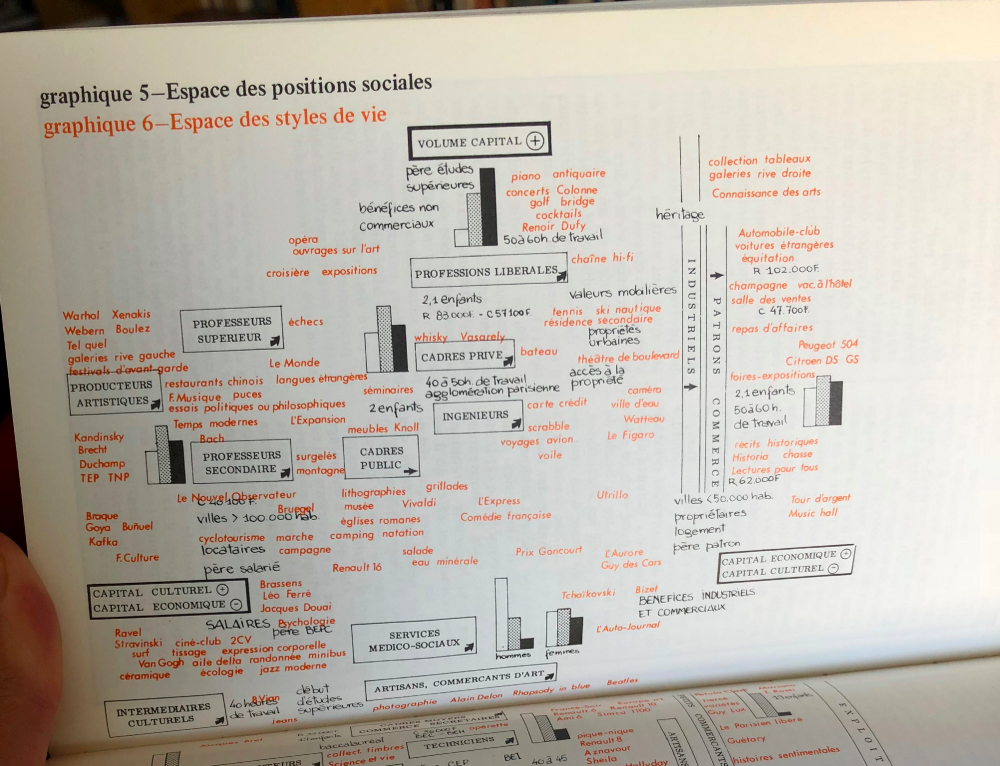
Still, even in its clearest form, the figure is really only useful as an illustration of the underlying intuition about the homology between the two spaces. As an example of correspondence analysis, it does little to aid the reader. There are neither axes nor eigenvalues indicating the contribution of each factor to the overall “inertia” or variation. As Bourdieu himself notes in Distinction, analyses of correspondence were only drawn on in the construction of the figure. In a recent recollection, Monique de Saint-Martin reflected on the ad hoc composition of this diagram, which was completed manually and only in its last stages drew inspiration from correspondence analysis:
At the time that “Anatomie du goût” was being prepared, we designed, sketched, and re-sketched numerous graphs, figures, diagrams, histograms. They would have to be located and studied if we are to understand how the spaces of social positions and lifestyles were progressively and tentatively constructed
This ad hoc formation and its artful final form should encourage us to think of the diagram alongside other pre-mechanical attempts, like those of W.E.B. DuBois for The Philadelphia Negro and “The Georgia Negro” (even if the latter surpass it in terms of precision and aesthetic appeal). Yet to this similarity we should add the caveat that Bourdieu and Saint-Martin were seeking out novel ways to illustrate a space they presumed was comprised of multiple dimensions.
Correspondence analysis affords particular sensitivity to the multidimensional, but the diagram’s creators hoped to press even further, incorporating a temporal dimension. This attempt, manifest in the addition of arrows indicating the trajectories of various occupational groups, was nevertheless judged insufficient in this regard. These arrows, stuck on the flat page, give only the most primitive indication of change over time. As Saint-Martin writes, other theoretical possibilities existed:
To grasp better the dynamics of the different groups we would have hoped to provide a volumetric representation of these spaces in three dimensions, a little like mobiles floating in the air
This intuition of how the social world operates again makes recourse to the arts. Bourdieu himself would describe his vision of society by analogy to Alexander Calder’s mobile sculptures. The social world, for him, is a space in which “there are kinds of small universes that drift in relation to each other through a space of several dimensions”. If the limitations of visual representation hamper the depiction of certain social phenomena, they nevertheless give a concrete image to envision these processes not yet realized in publication.
Though given the debt that the Actes de la recherche journal owed to its comic book or “bande dessinée” aesthetic, it is not improbable that it could have somehow integrated something like a flip-book. Jean-Louis Fabiani considers the aesthetic of Actes de la recherche and Distinction in particular as parts of an attempt to trouble linearity and unidimensionality, especially with their prodigious use of visual aids and heterodox statistical techniques. So, for Fabiani, rather than being driven by technical concerns for the best way of making sense of data collected, correspondence analysis and its visual expressions represent part of a broader approach to thinking the social world anew:
Unilinearity mutilates part of the object and shrinks social space down to one of its dimensions. To restore the whole picture, it is appropriate to use all the resources of the printed page. Thus, the partial recourse to multiple correspondence analysis is one instrument among others of a strategy of exposition, rather than the expression of a methodological choice
Without going as far as Fabiani does here — to diminish the theoretical significance of correspondence analysis to the Bourdieusian approach — we can see that the formal properties afforded by the geometric method grant weight to a particular way of thinking about the social world. So Boltanski would write that the journal’s particular aesthetic offered “in the visual another way [for abstract concepts] to manifest themselves and take on flesh”. This implies it is not as easy as Fabiani imagines it to distinguish the “technical” from the aesthetic in this instance. Therefore, to describe Bourdieu’s scientific enterprise as taking place in something like an “atelier” is not as figurative as it first sounds.
